Promotions Widget
The Promotions widget puts a loyalty reward in front of shoppers who haven't earned it yet. Instead of waiting for customers to discover their rewards balance on their own, you advertise a workflow's offer — or a standalone announcement — as a small pop-up nudge card and/or a banner across your storefront.
Advertising, not redeeming
The widget only tells shoppers about a reward. It never issues credit or applies a discount — the linked workflow still does that automatically, and customers still spend their balance with a code at checkout. See How customers redeem rewards.
What it does
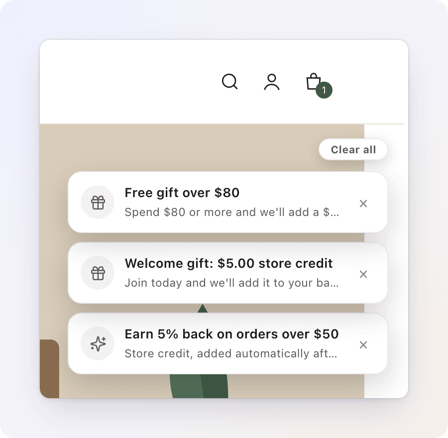
- Nudge card — a small toast-style card in the top-right corner of the page, just below your theme's header, similar to a notification. As a shopper browses, more promotions can join, and the cards stack into a deck they can fan out.
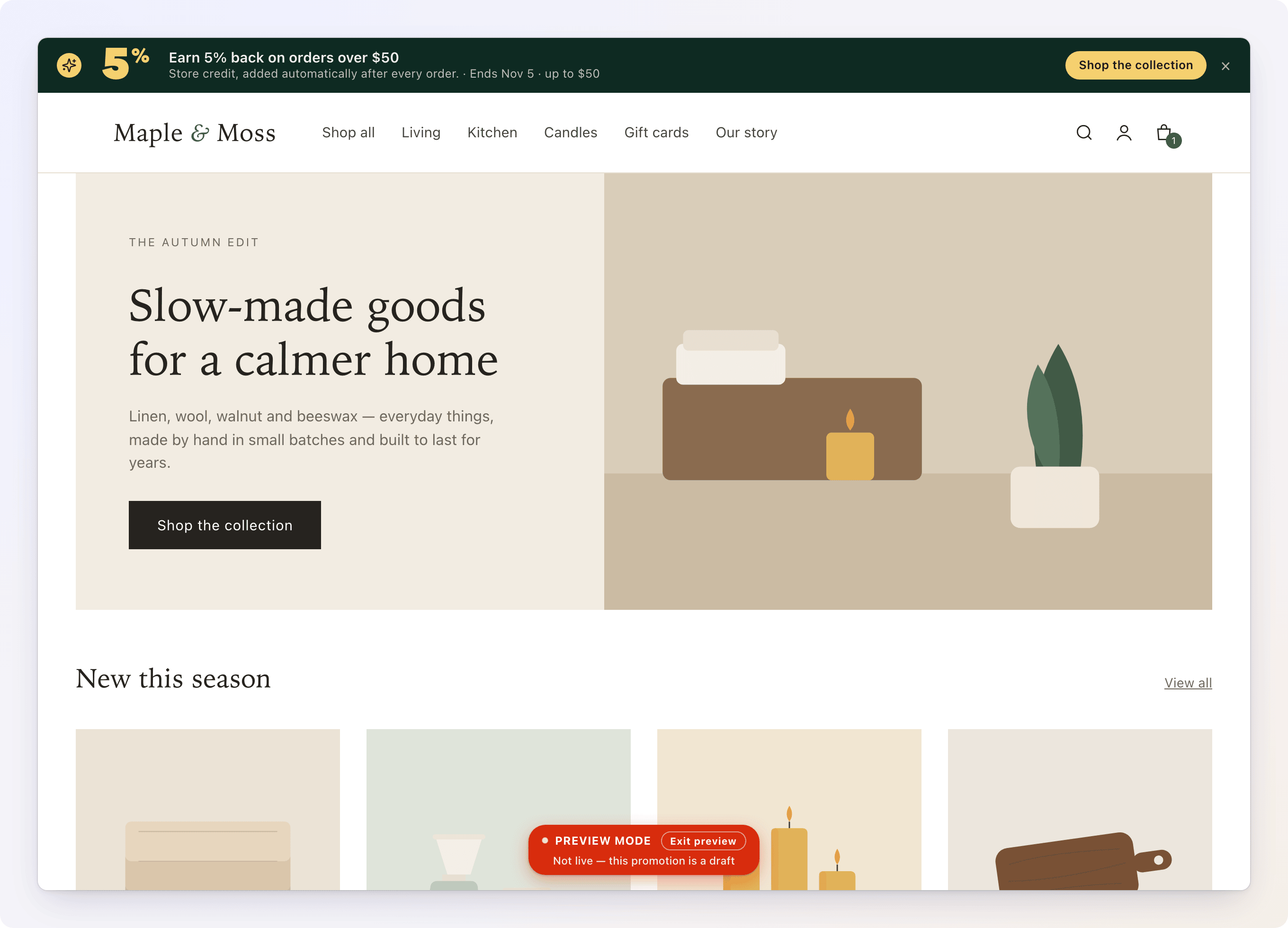
- Top banner — a bar across the very top of your storefront, built from one of 14 ready-made templates (a plain text bar, an image layout, a countdown, a progress meter toward a spend threshold, and more). When several banners qualify, they take turns.
- Numbers stay honest. A promotion linked to a workflow always shows the reward the workflow actually pays — if you change the workflow's cashback percentage, the ad updates itself. It can understate an offer, never overstate it.
- No codes, no discounts. The button on a promotion only takes the shopper to a page (a collection, a product, or your rewards page) — it never applies a code. The reward itself is store credit, issued by the workflow.
- Measured. Each promotion reports how often it was seen and clicked and which orders followed it. See Loyalty Analytics.
Nothing to switch on
There's no separate on/off setting for the widget. It appears on your storefront automatically as soon as you have at least one Active promotion, and disappears again if you have none — as long as Gift Card Hero's storefront embed is turned on in your theme (it already is, if any other Gift Card Hero storefront feature works for you).
Quick start
- Open the workflow you want to advertise from Manage Workflows, and make sure it's saved (the workflow needs to exist before you can link a promotion to it).
- In the workflow builder toolbar, click Advertise.
- Click Create promotion. This opens a new tab with a draft promotion already titled after your workflow, set to show as a nudge to all shoppers, guests included.
- Fill in a Title, Body, and CTA label / CTA target — write it the way you'd want a shopper to read it. You don't need to touch the reward numbers; they come from the workflow.
- Under Design, switch on Show this promotion as a top banner as well if you want more reach, and pick a template.
- Click Preview on storefront to check how it looks on your real store.
- Set Status to Active under Publish (or click Activate now in the banner at the top of the page), then save.
Shoppers see it on their next page view — there's no cache to clear, though your theme may hold a cached page for a few minutes.
To find your promotions later, open the Loyalty Dashboard (from Home, Loyalty & Rewards → Open loyalty) and click Manage Promotions.
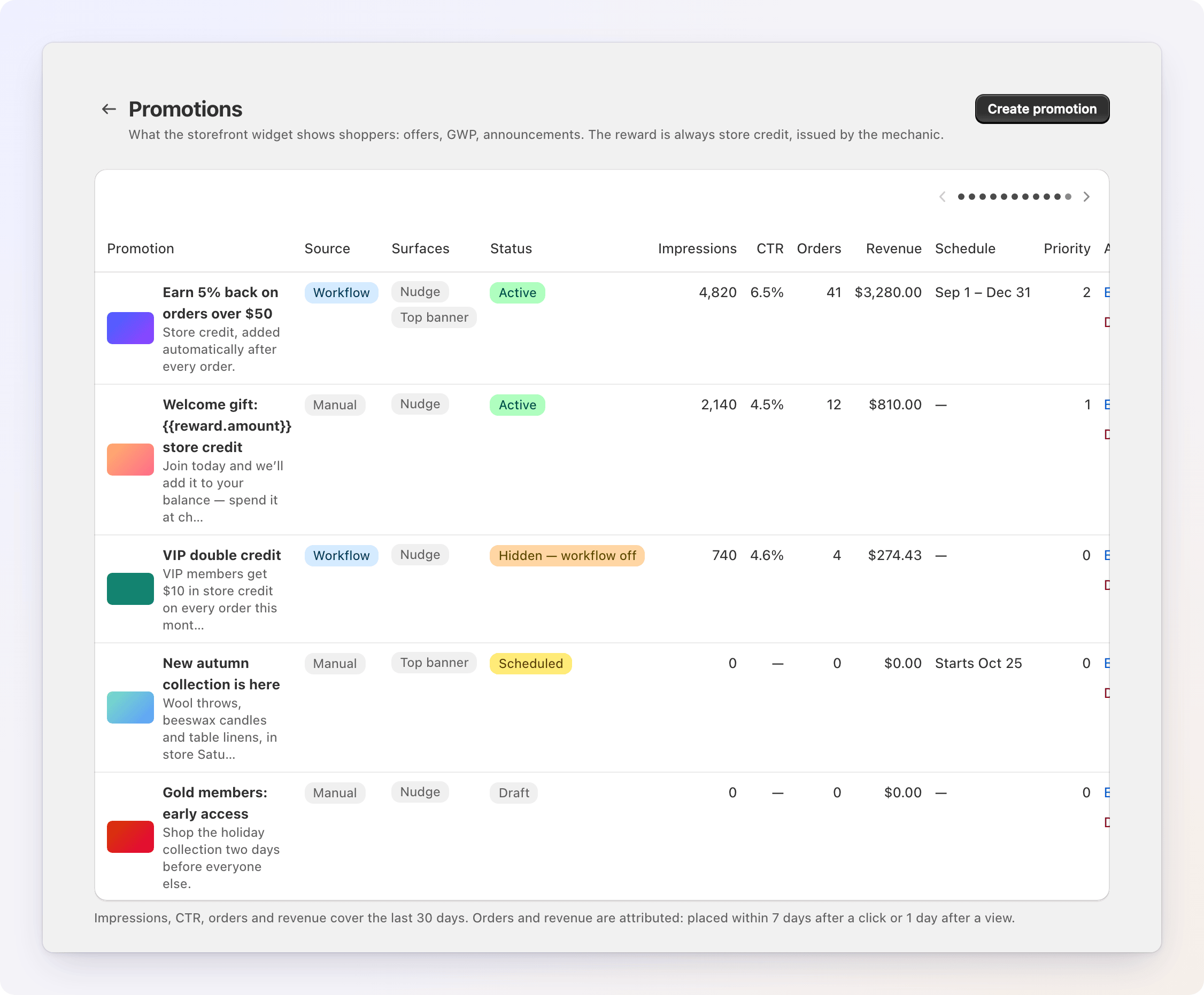

Two ways to create a promotion
- From a workflow — the toolbar's Advertise button. Create promotion (or Create another) makes a new draft linked to that workflow; Link existing… attaches a standalone promotion you already created on the Promotions page. A workflow can have several linked promotions, but each promotion belongs to at most one workflow. The button shows how many promotions are linked, and clicking a linked promotion opens it in a new tab. Unlink detaches it.
- Advertise is disabled until the workflow is saved, and again while it has unsaved edits.
- Create promotion and Link existing… are disabled if the workflow has no reward action yet — there'd be nothing honest to advertise.
- A new draft starts with the workflow's name as its title. If the workflow is limited to certain collections, When to show is pre-filled with them.
- Standalone, on the Promotions page — on the Loyalty Dashboard click Manage Promotions, then Create promotion. Use this for announcements that aren't tied to a specific workflow (a gift-with-purchase, a sale, general news). You enter the reward numbers yourself under Offer. A new standalone promotion starts as a Draft, as a nudge, and shows to guests too.
A promotion linked to a workflow shows a banner at the top of its editor ("Linked to a workflow") with an Open workflow button. Unlinking it (from the toolbar, or by deleting the workflow) turns it into a standalone promotion — its content and current reward numbers are kept, they just stop updating automatically.
The promotion editor
The editor is a single page. Edits are saved with the save bar at the top, which appears as soon as you change something (Save or Discard). The page's actions are Preview on storefront and, for a saved promotion, Delete.
A saved promotion starts with its Performance card; see Loyalty Analytics. Below it the page has two columns:
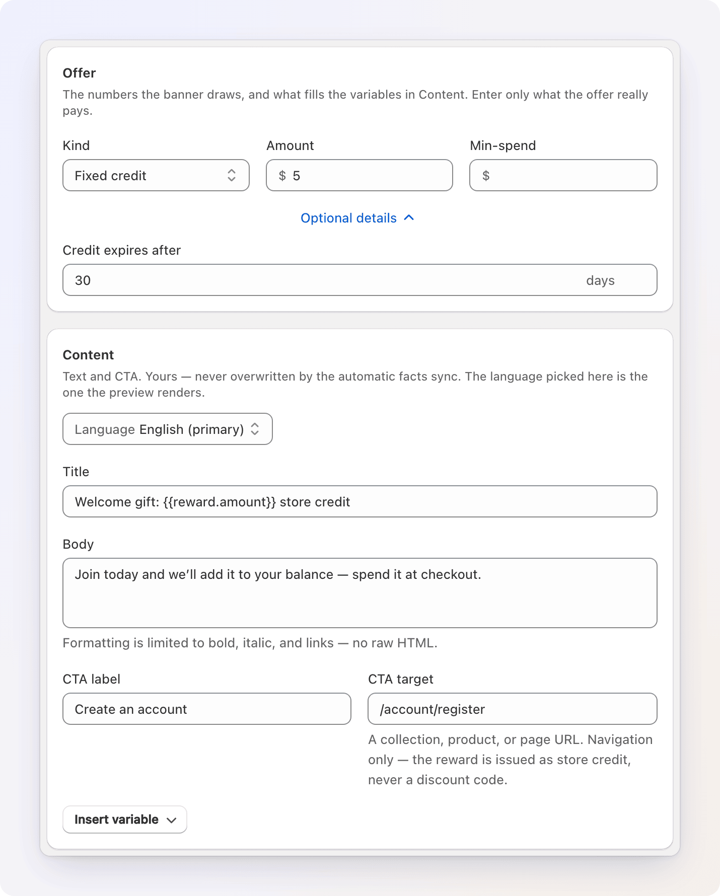
Offer
The numbers the banner draws and the values that fill the variables in your text. They also decide which banner templates are available.
For a promotion linked to a workflow, this card is read-only, marked From workflow. It lists what the workflow actually applies: the kind, the percentage or amount, the minimum-spend threshold, the payout cap, the expiry, and whether the tier multiplier applies. Click Open workflow to change them.
For a standalone promotion, you fill these in yourself:
| Field | Notes |
|---|---|
| Kind | Cashback, Fixed credit, Threshold gift, Tier perk, or Announcement. |
| Percent back | For Cashback. |
| Amount / Gift value | For Fixed credit and Threshold gift. |
| Min-spend | Optional minimum spend. It unlocks the Goal meter template. |
| Max payout (cap) | Under Optional details, for Cashback. Shows as "up to $X". |
| Credit expires after | Under Optional details. Number of days. |
Enter only what the offer really pays — these numbers are what the templates render as text.
Content
| Field | What it does |
|---|---|
| Title | The headline. The only required field. |
| Body | Supporting text. Bold, italic, and links are allowed — no raw HTML. |
| CTA label / CTA target | The button text and the URL it opens — a collection, product, or page. There's no code to enter; the CTA is navigation only. |
| Insert variable | A button under the CTA fields that opens the list of live numbers you can drop into your text — see Using variables below. |
If your store sells in more than one language, a Language select appears at the top of the card (one entry per published language, your primary language first). Choose a language and every text field on the page edits that translation, and the preview follows. Leave a translation empty and it falls back to your primary language automatically.
Design
The Design card is where you decide where the promotion appears and how it looks. It has two tabs, Top banner and Nudge. Each tab shows an On or Off badge for whether the promotion is shown there.
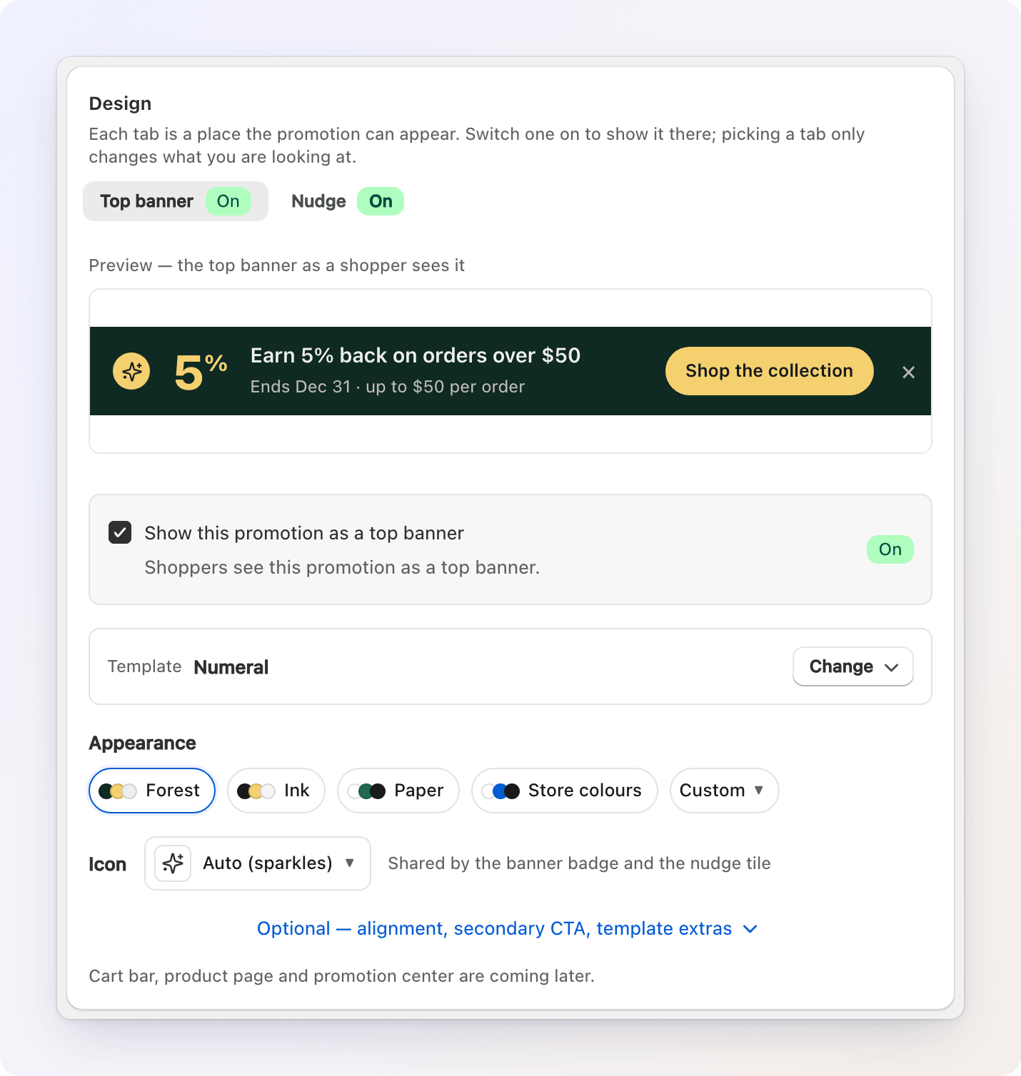
Picking a tab only changes what you are looking at and editing. To publish the promotion on that surface, tick Show this promotion as a top banner (or … as a nudge) under the preview. At least one surface has to be on.
From top to bottom, each tab has:
- Preview — the promotion as a shopper sees it, with variables filled in from your Offer and a sample cart. It stays in view while you scroll through the controls below it.
- The surface switch described above.
- Banner tab only: Template — a row that names the current template. Click Change to open the catalog of 14 templates. See Banner templates. Templates that need an image also show an Image URL field (paste the CDN link of a file from Shopify's Files).
- Appearance — preset color chips, an Icon picker, and a Custom chip that reveals colors, corners, theme and font. See Appearance.
- Banner tab only: Optional — a collapsed section with Alignment, a Secondary CTA (ghost button), and extras for some templates.
The Nudge tab is text-led: the title, body and CTA come from Content. Banner templates and images don't apply to it.
Other places are coming later
A cart bar, a product-page banner and a promotion center are planned. They aren't available yet.
Banner templates
Every template renders from the same Content and Offer — pick the one that fits, and switch anytime. A template that needs something you haven't provided is greyed out in the catalog, and its tooltip tells you what to add. Templates that you can still pick but are missing something (an image, say) fall back to the plain Text only layout, so a banner never looks broken.
Smart — built from your numbers
| Template | What it shows | Needs |
|---|---|---|
| Numeral | The reward number itself as the headline — "10%" or "$10" | A percent or fixed-amount reward in Offer |
| Countdown | A live, ticking countdown to the promotion's end date | An end date under Publish |
| Goal meter | A progress bar toward the minimum spend — "$12 away from…" | A Min-spend amount in Offer |
| Live receipt | The exact credit this shopper's current cart would earn, itemised | A percent or fixed reward. On stores with tax-inclusive pricing it shows the Numeral look instead, because an exact figure would overstate the credit. |
| Ticket stub | A perforated stub with the reward amount as the tear-off | Works with or without a reward number |
Classic — image and text layouts
| Template | What it shows | Needs |
|---|---|---|
| Text only | One bar: icon, title, body, and a button | Just your title and CTA |
| Image left / Image right | The bar plus a small thumbnail | An Image URL |
| Full bleed | Your image (or a background color) fills the whole bar; a taller Hero height is available | An image URL, or a background color |
| Split 50/50 | A hard-edged product tile beside stacked text | An Image URL |
Brand — copy-led
| Template | What it shows | Needs |
|---|---|---|
| Member strip | An always-dark, VIP-styled strip for tier perks, with a medal letter you can set | — |
| Editorial | Plain, quiet text with a ruled link — no color block | — |
| Ticker | A scrolling marquee of your title, body, and end date. Pauses on hover or focus. | — |
| Peek strip | A collapsed one-line strip that expands on hover or tap | Body text or a CTA link, so there is something to reveal |
A few templates have extras under Optional: Countdown display (Auto, Cells, or Text) for Countdown, Height (Bar or Hero) for Full bleed, Speed (Normal or Slow) for Ticker, Unlocked title (shown once the cart reaches the threshold) for Goal meter, and Medal letter for Member strip.
The Goal meter reads your Title as the reward itself and builds the sentence around it. A title of "a free travel-size Night Cream" becomes "$12 away from a free travel-size Night Cream".
Appearance
Every template — and the nudge card — shares the same appearance controls.
- Presets. A row of color chips gives each template a few ready-made palettes, such as Violet, Midnight or Paper. The first chip is the template's default. Click one to apply it.
- Icon. A picker for the small icon on the banner badge and the nudge tile. Choose Auto (an icon that follows the reward kind: sparkles for cashback, a gift for fixed credit and threshold gifts, a medal for a tier perk, a tag for an announcement), None, or any icon from a searchable catalog. The same icon is used on both surfaces.
- Custom. Click the Custom chip to open the detailed controls: the colors (Background or Card, Text, Accent, and for most banner templates Button background and Button text), Corners (Square, Soft, Round), Theme, Font (System or Theme's font), and for the nudge a Shadow switch. Use template colours resets the colors.
Theme follows your storefront's own background, never the visitor's device — pick Auto to match your theme automatically, or pin Light / Dark.
A contrast badge, "Text on background 7.2 : 1", warns you if your text is hard to read against your background. It never blocks saving.
Using variables in your copy
Drop a live number into your Title, Body, CTA label, or CTA target instead of typing it by hand — so if the workflow's percentage changes, your copy updates with it.
Earn {{reward.percent}}% back on orders over {{reward.threshold}}
| Variable | Resolves to | Only valid when |
|---|---|---|
{{reward.percent}} |
10 |
The reward is a cashback percentage |
{{reward.amount}} |
$5.00 |
The reward is a fixed credit amount |
{{reward.threshold}} |
$50.00 |
A minimum-spend gate is set |
{{reward.cap}} |
$50.00 |
A payout cap is set |
{{reward.expiresInDays}} |
30 |
An expiry is set |
{{reward.value}} |
10% or $5.00 |
Any reward with a number — picks the right format automatically |
{{cart.total}} |
$42.00 |
The shopper has items in their cart |
{{cart.remaining}} |
$8.00 |
A threshold is set and the cart total is known |
Click Insert variable under the CTA fields and choose one: it is inserted where your cursor was in the last field you edited. Money is formatted in your store's currency automatically. The preview fills variables in from your Offer and a sample cart.
A variable that can't resolve for this promotion (say, {{reward.amount}} on a percentage reward) shows a warning above the Content fields before you save, and simply renders as blank text on the storefront — never a literal {{…}}.
Publish
The Publish card in the right column controls when the promotion is live.
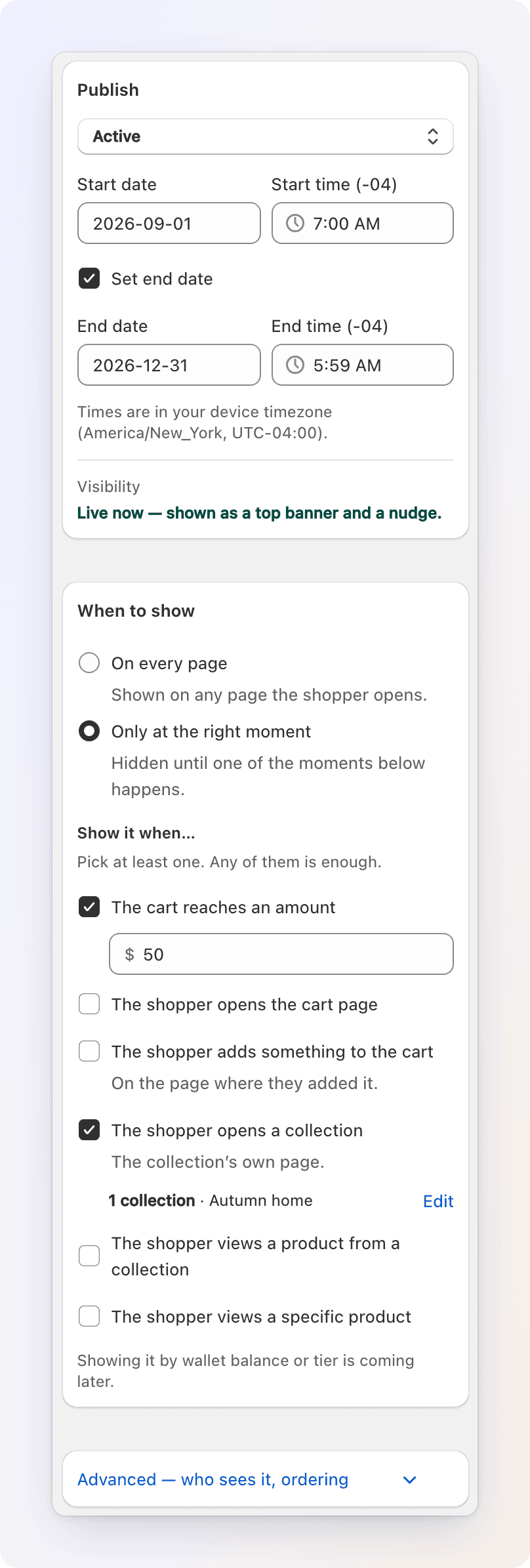
- Status. Draft is hidden from the storefront. Active goes live on the storefront during its dates. Scheduled and Ended aren't things you pick directly; they're derived automatically from the dates below.
- Start date and Start time. A new promotion is set to start at the moment you opened the editor, so it goes live as soon as it is Active. Pick a later date and time to schedule it instead. A promotion with no start date runs from the moment it was published.
- Set end date. Tick it and pick an End date and End time to have the promotion stop automatically. Its status badge changes to Ended, and the Countdown template uses the end date to build urgency.
- Times are in your device's timezone; the card says which one.
- Visibility. A single line at the bottom answers "will a shopper see this?" It reads, for example, "Live now — shown as a top banner and a nudge.", "Draft — nobody sees it yet. Set the status to Active to publish it.", "Starts 30 Sep, 10:00 — hidden until then.", or "No placement picked — switch on a banner or a nudge under Design." Fix the reason it gives, and it shows the next one, if there is one.
When to show
The When to show card decides on which pages the promotion appears. Pick one:
- On every page — the promotion is shown on any page the shopper opens.
- Only at the right moment — it stays hidden until one of the moments you tick happens. Tick at least one; any of them is enough.
The moments:
| Moment | Happens when |
|---|---|
| The cart reaches an amount | The shopper's cart total reaches the amount you set |
| The shopper opens the cart page | The shopper is on your cart page |
| The shopper adds something to the cart | Right after an add to cart, on the page where it happened. On the next page it's gone again |
| The shopper opens a collection | The shopper is on the page of a collection you choose |
| The shopper views a product from a collection | The shopper is on the page of a product that belongs to a collection you choose |
| The shopper views a specific product | The shopper is on the page of a product you choose |
Collections and products are picked with Shopify's own picker, which opens as soon as you tick the moment. The row under the moment shows how many you chose and the first few names; click Edit to change the selection. A long product list makes every storefront page a little heavier, so for more than a few hundred products pick a collection instead.
You can tick moments under On every page too. The promotion still shows everywhere, but at those moments it goes ahead of your other promotions, and its nudge isn't held back by the limit on pop-ups per visit. A nudge still pops up at most once per visit, even if its moment happens again (a second add to cart, say).
The Active dates from Publish apply to every promotion whichever option you pick. Showing a promotion by wallet balance or tier is planned for a later release.
Advanced: who sees it and ordering
Click Advanced — who sees it, ordering at the bottom of the right column.
- Include guests. Check it to also show the promotion to shoppers who aren't signed in. Leave it unchecked to show the promotion only to signed-in customers. New promotions have it checked.
- Tiers and Customer tags. These fields are visible but disabled. Targeting by tier or tag isn't active on the storefront yet, so today every shopper who matches the moment sees the promotion.
- Priority. A plain number, used only as the last tiebreaker when Gift Card Hero has to choose between several eligible promotions (see How shoppers see it). The higher number wins.
Previewing on your storefront
Click Preview on storefront at the top of the editor to open your live storefront in a new tab with this exact draft shown — including edits you haven't saved. Give the promotion a title first: without one there's nothing to show, and the editor tells you so.
- The preview shows only the promotion you're editing, and only the surface (banner or nudge) of the Design tab you were looking at. Your live promotions don't appear next to it.
- A Preview mode pill at the bottom of the page marks it. If shoppers wouldn't see the promotion right now — it's a draft, scheduled for later, ended, or that surface is switched off — the pill says why.
- Buttons in a preview don't navigate; the pill answers instead ("Links are not available in preview").
- The preview is never saved, never shown to real shoppers, and never counted in your analytics.
- It follows you through the store for about 30 minutes in that tab. Click Exit preview in the pill to go back to the live widget without reloading.
How shoppers see it
- The nudge deck sits in the top-right corner, just below your theme's header. At most one new card joins per page view, and cards stack up to 5 deep (3 visible collapsed). Hovering or clicking fans them out, and clicking a card navigates to its CTA. A Clear all link appears once there are two or more cards.
- The banner appears as a bar at the top of the page, sliding in smoothly. When more than one banner promotion qualifies, they take turns: each stays for about 7 seconds, and the rotation pauses while the shopper hovers over the bar or has keyboard focus in it. Dismissing the visible banner hands over to the next, and the last one closes the bar.
- Gift Card Hero picks the best match first: a promotion whose moment fits the current page or cart wins, then the most urgent (closest end date), then whichever the shopper hasn't seen yet, with your Priority number as the final tiebreak.
- Dismissing a nudge (the ×) or clicking Clear all hides it for 7 days before it's eligible to show again.
- A shopper is pushed at most 3 unprompted nudges per browsing session. A promotion that matches their current cart or the page they're on isn't capped, since that's exactly the moment it's useful.
- A shopper only sees promotions that match their audience setting — guests only see a promotion if you checked Include guests.

When a workflow pauses or ends
- Deactivating or pausing a linked workflow (including an automatic pause from a budget guardrail) hides every promotion linked to it — you'll see Hidden — workflow off on the Promotions list, and a warning banner in the promotion's editor. Reactivate the workflow and the promotion reappears with no extra steps.
- Deleting the linked workflow doesn't delete the promotion. It unlinks and drops to Draft, with its last-known reward numbers frozen in place — edit it into a standalone promotion, or delete it separately.
- Reaching its end date moves a promotion's status to Ended on its own; it simply stops showing.
FAQ / Troubleshooting
A promotion isn't showing up on the storefront. Check the Visibility line in the Publish card first; it names the first problem. Then, in order:
- Is its Status actually Active? Draft never shows.
- Is a surface switched on under Design — Show this promotion as a top banner or … as a nudge?
- If it's linked to a workflow, is that workflow Active? A paused or inactive workflow hides every promotion linked to it (you'll see Hidden — workflow off in the list).
- Do the Active dates include right now? A future start date or a passed end date both hide it.
- If you're testing as a guest (not signed in), is Include guests checked?
- If it's set to Only at the right moment, is one of its moments actually happening? For example, The shopper views a product from a collection only fires on the page of a product in that collection, not on the collection's own page, and The shopper adds something to the cart only right after an add.
- Did the shopper already dismiss it? A dismissed promotion stays hidden for 7 days in that browser.
- Has Gift Card Hero's app embed ever been enabled for this theme? It powers every Gift Card Hero storefront feature, this widget included.
One of my {{variables}} shows up blank. The variable doesn't apply to this promotion's reward — for example {{reward.amount}} on a percentage-based reward, or {{cart.total}} on a page with no cart. Check the warning above the Content fields; it lists exactly which variable and why, before you save.
I can't pick a banner template. It's greyed out because something it needs is missing. Hover over it to see what: a percent or amount in Offer (Numeral, Live receipt), an end date in Publish (Countdown), a Min-spend in Offer (Goal meter), or body text or a CTA link (Peek strip).
Can a shopper redeem straight from the widget? No — the button only navigates. The reward itself is issued automatically by the workflow as store credit, and the shopper still gets it the normal way, through their rewards balance and a code at checkout.
I have several eligible promotions — why do I only see some of them? By design, a page view adds at most one new nudge card to the deck, and the banner bar shows one banner at a time. Banners rotate every few seconds; nudges join the deck as the shopper browses.
How do I know if a promotion works? Open it and look at its Performance card, or see the promotion columns on the Promotions list. Loyalty Analytics explains every number.